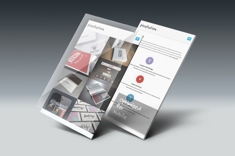
Optimised for Mobile
Pixelution websites are all fully optimised for mobile devices. Our designs not only function on all devices, they are fully optimised to take advantage of what different devices have to offer your visitors.
Our mobile optimised sites include:
- Dynamic ‘one click navigation’
- Retina display ready
- Larger text
- Calls to action
- One click phone call options
- & more
Dynamic one-click navigation provides the user with an option to open the navigation menu from a tidy menu button typically in the top right corner of the screen; managing menus in this way allows greater screen real estate. What this means is a clearer message (mobile visitors can concentrate on what is most important; your content). This approach is much cleaner, more modern and provides a polished experience for your visitors.
- Categories: Mobile / Responsive / Web Design